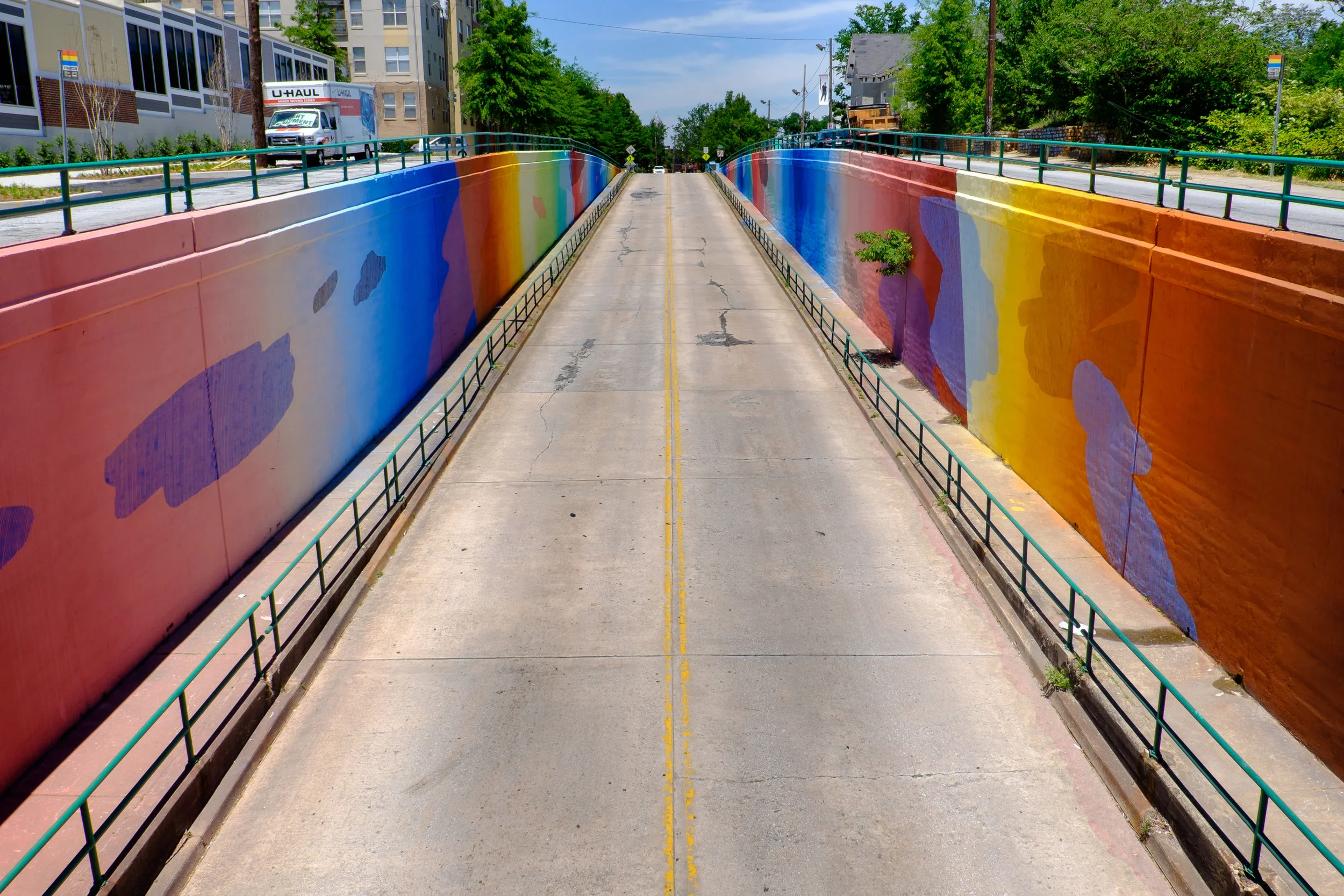
Living Walls provides contemporary thought-provoking art created with intentionality and community support.
year
2016- Present
role
Art Director
Team
Tim Lampe
Mònica Compana
―
Living Walls: The City Speaks branding has always reflected the DIY nature to it's program, but as it grew up in 2016, it needed branding to reflect that. I was brought on to build out a full brand system for Living Walls and it's programming such as the Living Walls Conference.
The History of Living Walls
Living Walls, a public arts organization based in Atlanta, GA began in 2010 with executive director Mònica Compana. The first conference was in August 2010. In Atlanta, murals have become synonymous with Living Walls. It has changed the city, added personality, started conversations and become an arts staple. The conference has inspired many other cities across the world to celebrate their city the same way. There was never a proper branding for Living Walls so this project was really daunting.
"Living Walls is an internationally recognized organization that is a leader in the space. The branding will evolve from the DIY look to be modern and intentional."
The Logo
The identity includes a logo icon that translates into smaller applications. There is a separate logomark and wordmark. The final identity is meant to be simple and modern
Primary Living Walls Logo Mark
Primary Living Walls Word Mark
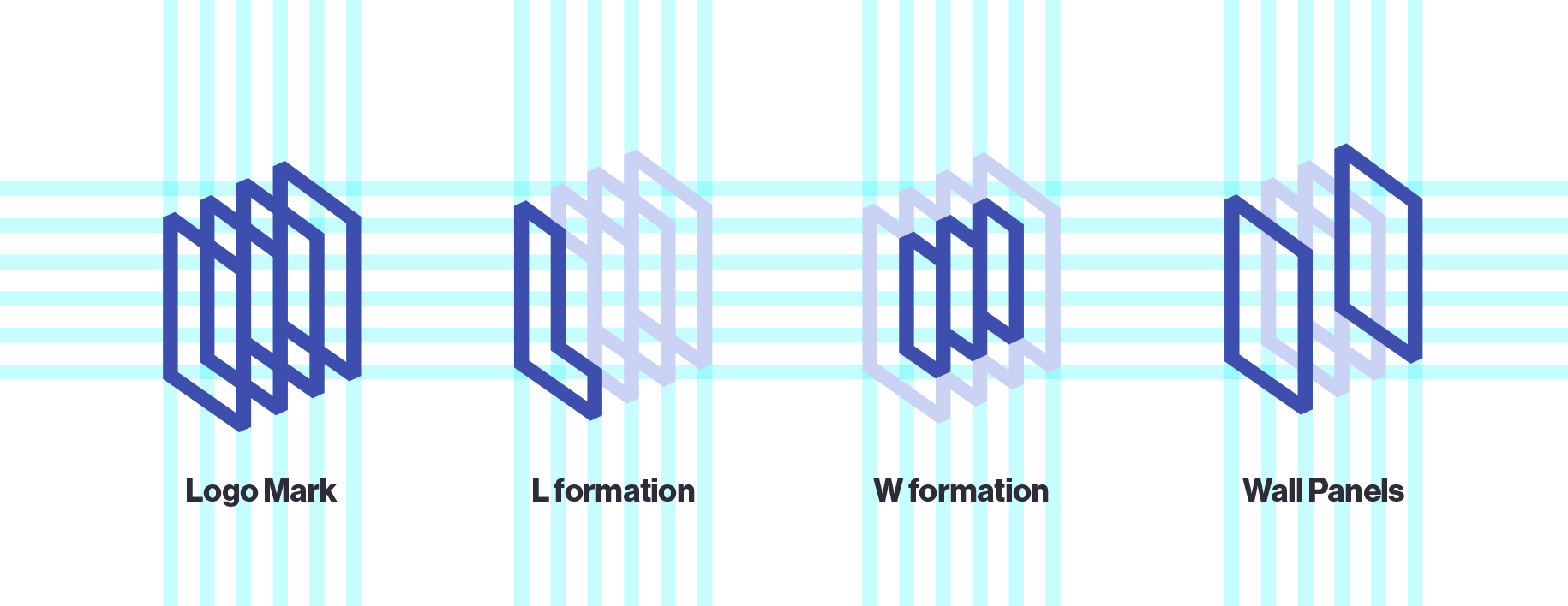
The logomark represents the collection of artists works/walls, as well as an L and a W.
Developing the Brand
Working on the brief, we put together some concepts of what the branding should be. The branding should reflect Living Walls goal that there is a way for contemporary thought provoking art to be created with intentionality and community support. The four words that summed up the brand according to Monica were Intentional, Empowering, Sustainable and Inclusive. The two biggest branding concepts going into the exploration were:
Modern
Using geometric shapes, bright colors and clear type systems. No unnecessary flourishes or complex graphics, focusing on minimal elements and a single type family in use.
Intentional
Using thoughtful typefaces paired well with eachother, grid-based layouts and hierarchy. Some aspects may look speciazlied or out of place, but is intentional with application.
I wanted to present three brand directions so we went with Modern, Intentional and a third which would be 'provoking'. Later we would decide that there were other areas in which LW could provoke, but the branding should not reflect that.
A collection of brand materials that didn’t make the cut through early brand directions along with some materials that made it’s way into the final.
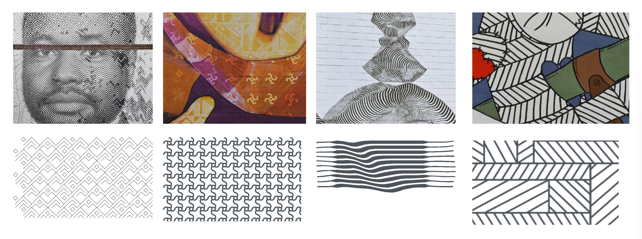
Pattern and Color Inspiration
There's such a rich history of walls in Atlanta already to grab from. I decided to explore grabbing colors and inspiration from the existing artist walls. I developed color selections and gradients based on some of the popular murals already up in Atlanta. I looked at unique shapes and patterns from the walls themselves. Not looking to directly copy the artists work, I tried to make them look inspired some of murals themselves, so you'd recognize the wall each pattern was referring to.


