Exploring the absurdity of life through the setting of breakfast.
year
2018-Present
role
Art Director/Editor
Team
Tim Lampe - Art Director
Laura Lynn Johnston - Copy Editor
―
Morgenmete is a food journal exploring the absurdity of life through the setting of breakfast.
Not your typical food journal, Morgenmete is a bi-annual print journal covering breakfast that combines humorous writing, photography and illustrations in a sendup of curated culture.
Breakfast is Life
My first print explorations were crafting newspapers around a summer of ice cream sandwiches and Link in Bio, an absurd look at self-promotion. Since I was a kid, humorist writing has been with me but not until now did I embrace my inkling to explore breakfast in a satire setting.
I spent the last two years writing 10,000 words on breakfast and learned a lot. The setting of breakfast became the playground for this project.
Introducing Morgenmete: World’s Best Breakfast Satire
You can purchase the first issue here
Morgenmete primary logo set in GT Sectra Black
What is it?
morgen-mete, m.n: a morning meal, breakfast.
The idea originally had roots in creating a publication that would be a send-up of curated culture magazines. I was looking for a name that sounded as pretentious as some of the food mags I had seen around. In Old English, the word for breakfast was morgenmete. It was a compound word, with morgen meaning “morning”, and mete meaning “food” or “meal”. Therefore, morgenmete literally meant “morning meal”
Cover of Issue 01 and back cover featuring original photography by Tim Lampe and Hales Photo
80 Pages of colorful art direction and original layout by Tim
Issue 01
The first issue is a blank canvas. What is the editorial tone? Who is this for? What will the written pieces sound like? All these were tough questions to answer going into the formation of this journal. Ultimately, Issue 01 is a reflection of the work I put in along with the 16 collaborators who helped this issue come to life.
I put out a call to some of my favorite writers, illustrators and photographers and was blown away by the submissions for this inaugural issue. I was overjoyed with how well the work came together with my loose editorial vision for this. The biggest overlapping theme for Issue 01 revolved around death and breakfast, and the anxiety of living.
Issue 01 features new, incredible work from the following artists: Jason Travis, Andy J Miller, Danielle Evans, Tommy Perez, Grace Danico, Amber Vittoria, Andrea Sparacio, Pablo Alfieri and Paloma Rincón, Cristina Vanko, Josh LaFayette, Felicia Rein, Kaitlin Boyle, Laura Lynn Johnston, Jason and Natalie Hales.
Illustration by Andy J Miller
Photo Essay by Hello Playful and Paloma Rincon
Illustration by Amber Vittoria
Playful type and design by Tim Lampe
“Hot, Sticky Virality” by Danielle Evans
Illustration by Andrea Sparacio
I approached the print layout from a place of character. Originally inspired by the specialized design of Lucky Peach print layouts, I started with many varying styles of type and layouts. It was a little bit of an overload. I streamlined the standard headlines in Sporting Grotesque, Domaine Text Light and body copy in Fakt Pro. The typefaces I used for features were Lydia Condensed, Traulha and Druk.
I’m not a specialized print layout person, so this layout was a lot of trial and error and seeing what works. Since it’s the first issue, there’s still a lot to improve on and smooth over.
Print Layout
Type details for Morgenmete Issue 01
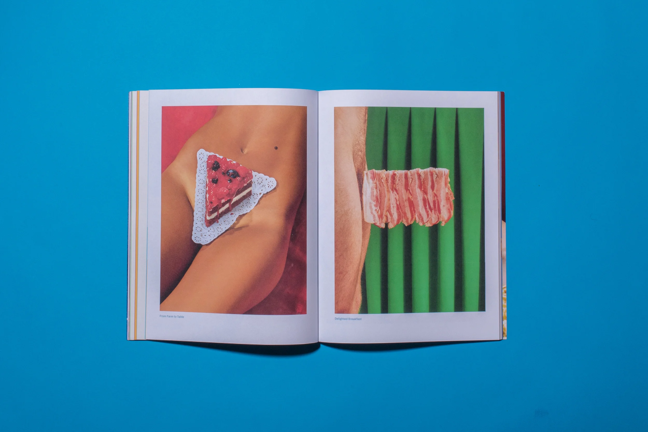
Feature Photography
For the first issue, I wanted to lean into an area I’m particularly passionate about: concept photography. I put together a set of photo ideas for the first issue, and was fortunate enough to work with the best commercial photo team in Atlanta: Hales Photo. They helped see through production of these first set of photos that would help set an editorial tone for Issue 01.
Marketing the thing
One of the best parts of this was having a blank slate as far as promotion goes. I got to create a lot of physical assets for the fundraising launch in 2018. It involved designing out pins, pennants, tote bags and newspapers.
For promotion on social, I got to create tons of illustrations and photographs around breakfast content. It’s been a dream to create an ongoing stream of visual assets without a strict style. It’s allowed me to play in a lot of spaces that I don’t normally and see if I can create in those.


